Colour and Contrast Accessibility
Contrast has an exact formula and an exact threshold, which makes it one of the few parts of accessibility you can verify with certainty. Here is how it works and how to design around it.

What a contrast ratio measures
Contrast ratio compares the relative luminance of two colours, how much light each reflects, weighted for how sensitive the human eye is to red, green and blue.
ratio = (L1 + 0.05) / (L2 + 0.05)

where L is relative luminance:
L = 0.2126 R + 0.7152 G + 0.0722 B  (after gamma correction)
The green coefficient dominates because human vision is most sensitive to green wavelengths. This is why pure yellow (full red plus full green) looks so bright and pure blue looks so dark despite both being “full intensity”.
Ratios run from 1:1 (identical colours) to 21:1 (pure black on pure white). The 0.05 constant models ambient screen reflection, which is why no real pair ever reaches infinity.
The WCAG requirements
| Content | Level AA | Level AAA |
|---|---|---|
| Body text | 4.5:1 | 7:1 |
| Large text (18pt, or 14pt bold) | 3:1 | 4.5:1 |
| UI components and graphics | 3:1 | 3:1 |
| Decorative or disabled elements | No requirement | No requirement |
Level AA is the practical standard. It is what the European Accessibility Act, the US Section 508 rules, the UK public sector regulations and most corporate policies require. AAA is aspirational and not achievable for all content, the WCAG authors say so explicitly.
The 3:1 requirement for UI components is the one most often missed. Form field borders, focus indicators, toggle states, icon buttons and chart elements all need to be distinguishable from their surroundings. A 1px light grey border on white is a common failure.
Check any pair in the colour converter, which includes a WCAG contrast checker.
Designing for colour vision deficiency
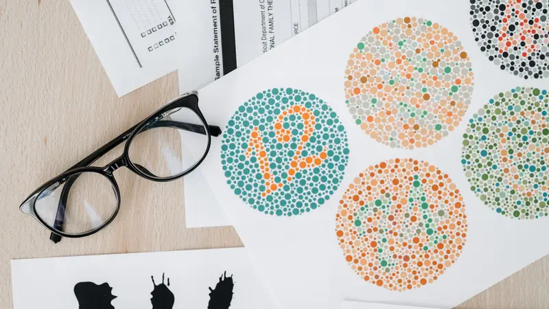
About 8% of men and 0.5% of women of Northern European descent have some form of colour vision deficiency, roughly 300 million people worldwide.
| Type | Prevalence | Effect |
|---|---|---|
| Deuteranomaly | ~5% of men | Reduced green sensitivity; the most common form |
| Protanomaly / Protanopia | ~1% of men | Reduced or absent red sensitivity; reds appear dark |
| Deuteranopia | ~1% of men | No green cones; red and green are indistinguishable |
| Tritanopia | ~0.01% | Blue and yellow confusion; very rare |
| Achromatopsia | ~0.003% | No colour perception at all |
The single most important rule: never use colour alone to convey information. WCAG 1.4.1 requires this. A red “error” and a green “success” that differ only in hue are the same message to someone with deuteranopia.
Redundant encoding solves it every time:
- Form errors: red border plus an icon plus text describing the problem.
- Charts: different line styles or direct labels, not just different hues.
- Maps: patterns and textures in addition to fill colour.
- Links in body text: underlined, not merely coloured.
- Status: an icon or word alongside the colour.
Building an accessible palette
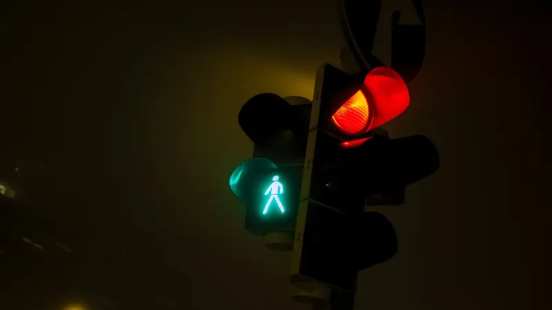
Design the palette around contrast from the start. Retrofitting accessibility onto a finished brand palette is far harder than building it in.
- Start with text colours. Establish body text and background first, and confirm 4.5:1 before choosing anything else.
- Build a lightness scale. Nine or ten steps from near-white to near-black for each hue. Use OKLCH so equal lightness steps look equal.
- Test every pairing you intend to ship. A brand colour that fails on white may pass on a dark background, or need a darkened variant for text.
- Never rely on hue difference alone. Two colours can be wildly different in hue and nearly identical in luminance, which means near-zero contrast.
- Check the dark theme separately. Inverting a light palette rarely produces good contrast; pure white on pure black is uncomfortably harsh and often needs softening to around #E6E6E6 on #121212.
A practical starting point that works: text at least #595959 on white (7:1), secondary text no lighter than #767676 (4.54:1), borders and dividers at least 3:1 against their background.
Build and test colour ramps in the colour converter and browse named colours with contrast ratings.
Accessibility beyond contrast

Contrast is the most measurable requirement, not the only one.
- Focus indicators. WCAG 2.2 added specific requirements: the focus indicator must have at least 3:1 contrast and cover a minimum area. Never write
outline: nonewithout providing a visible replacement. - Text over images. Contrast varies across the image. Use a gradient scrim or a semi-opaque overlay to guarantee a floor.
- Placeholder text. Browser defaults are typically far below 4.5:1. Placeholders are also not a substitute for labels.
- Disabled controls. Exempt from contrast rules, but if users cannot see that a control exists, they cannot work out how to enable it.
- Motion and flashing. Nothing may flash more than three times per second, and
prefers-reduced-motionshould be honoured. - Font size and weight. A thin 300-weight face at 14px is hard to read even at technically passing contrast. Contrast requirements assume normal weights.
Testing your work
Automated
axe DevTools, Lighthouse and WAVE catch contrast failures, missing labels and structural problems in seconds. They find perhaps 30-40% of real accessibility issues, a useful floor, not a certificate.
Manual
- Navigate the entire page with only the keyboard. Every interactive element must be reachable and visibly focused.
- Zoom to 200% and confirm nothing is lost or clipped, WCAG 1.4.4.
- Use a colour blindness simulator on your key screens.
- Turn on the operating system high contrast mode.
- Read the page with a screen reader: VoiceOver, NVDA or JAWS.
In your build
Run axe-core in CI against key pages so regressions fail the build. Contrast failures reappear constantly during redesigns; an automated check is the only thing that holds the line.
Accessibility is not a compliance exercise. Better contrast helps everyone reading on a phone in sunlight, everyone over forty, everyone on a cheap monitor, and everyone tired at the end of the day. It is simply better design.
Frequently Asked Questions
What contrast ratio do I need?
4.5:1 for body text and 3:1 for large text or UI components at WCAG level AA, which is what most legislation requires. Level AAA raises these to 7:1 and 4.5:1.
How is contrast ratio calculated?
By comparing relative luminance: (L1 + 0.05) / (L2 + 0.05), where L weights red, green and blue by human sensitivity. Green counts for about 72% of perceived brightness.
What counts as large text?
18pt (24px) regular, or 14pt (18.66px) bold. At those sizes the AA requirement drops from 4.5:1 to 3:1 because larger glyphs are easier to distinguish.
How many people have colour blindness?
About 8% of men and 0.5% of women of Northern European descent, roughly 300 million people. Red-green deficiency is by far the most common form.
Can I use colour to show errors?
Yes, but never colour alone. WCAG 1.4.1 requires a second cue: an icon, a text message, a pattern or a change in position.
Does dark mode improve accessibility?
Not automatically. It helps some users with light sensitivity and hurts others with astigmatism. Offer both, and verify contrast independently in each, inverting a light palette rarely produces good ratios.
Do automated tools catch everything?
No. Automated testing finds roughly 30-40% of accessibility issues. Keyboard navigation, screen reader behaviour and content clarity all require manual testing.
Sources & further reading
- WCAG 2.2 Quick Reference, every success criterion with techniques and failures
- Understanding SC 1.4.3: Contrast (Minimum), the rationale and exact thresholds
- WebAIM Million, an annual accessibility survey of the top one million home pages
- GOV.UK: Designing for accessibility, the widely used poster series on inclusive design